
Top Mobile Marketing Trends to Watch in 2013
January 3, 2013 | By David George | 7 Comments">7 Comments
Think about your mobile phone for a second… where is it right now?
If I was a betting man, I’d wager that just a quick glance from your computer screen or a swift reach for your pocket is all it takes to locate it.
BUT, that wasn’t just a lucky guess. Mobile phones have become such an integral part of our daily lives. Current reports are showing that 91% of mobile users keep their phone within 3 feet of themselves at all times – that’s 24-7-365 baby!
And since mobile internet usage is projected to overtake desktop internet usage by 2014 (source: Microsoft Tag) there are 4 very important mobile marketing trends you need to know about to optimize your business for mobile search…
Keep an eye on these mobile marketing trends in 2013
“In the last twelve months customers around the world ordered more
than $1 billion worth of products from Amazon using a mobile device.”
– Jeff Bezos, CEO, Amazon
Every successful business has a sustainable, unique selling proposition – maybe the products are of the highest quality, or have the most features. But those businesses, especially those that are competing based on price alone, have started to realize what it’s all about – the mobile experience.
A good mobile experience, not lower prices, generates higher conversions, more sales, and more repeat customers. (Source: KISSmetrics)
1. Poor mobile web experiences can hurt business
A recent study done by technology firm, Compuware, has some very revealing insights on how crippling a bad mobile experience can be for a business:
- 74% of consumers will wait 5 seconds for a web page to load on their mobile device before abandoning the site.
- 46% of consumers are unlikely to return to a mobile site if it didn’t work properly during their last visit.
- 71% of mobile users expect web pages to load almost as quickly as, or faster than, web pages on their desktop computers.

Make sure that if there is any dynamic content on your mobile page, that you check its loading time. An easy, 3-step way to check this is to use the Google Chrome browser.
1. Open your mobile page up, right-click on it and choose “Inspect Element”.
2. Click on the Network icon in the window pane that pops up.
3. Refresh the page and Chrome will display a nice, informative timeline with each page element and its respective loading time. It will look like this:

If your page loads in less than 5-seconds, you’re doing well. If not, check which elements are the biggest data/time hogs and optimize those processes.
2. Click-to-Call holds the power
“The customer is only concerned about how they get their flowers to their wife on the day that it is most meaningful.”- Amit Shah, Sr. Dir. Online, Mobile, & Social Media, 1-800-Flowers
In this marketing age of shiny, new, and feature-packed websites and products, there is an old, time-tested action that is receiving the most attention right now – phone calls!
1-800-Flowers found that their customers were 2-3x more likely to click to make a phone call from their smartphone, than click any ad on their desktop computer. And they aren’t the only ones experiencing this phenomenon.
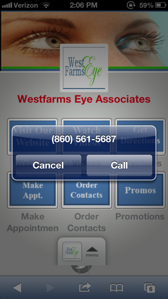 By simply giving their mobile site the ability for customers to “click-to-call”, Comcast has seen a wild boost in click-through rates by more than 270%! This has led to mobile advertising driving 10% of their total sales. (Source: CNN Money)
Esurance states that click-to-call features have improved the bottom-line of their marketing campaigns by about 25%. Adding to that, they say that calls coming from these types of click-throughs are more likely to result in sales, than typical phone inquires.
“Once you start focusing on experience, you start building feedback loops, and the only sustainable strategy when the marketplace is changing very quickly is to build these loops,” says Amit Shah.
3. Effective mobile landing page design is critical
We’ve learned things important like how to drive more traffic to your mobile site, but that does your business no good if customers bounce (leave) right after accessing your page.
It’s important to optimize your content for mobile interaction and navigation, because after all, we’re only using our thumbs!
- Specific, clear call to action. You probably know that a clear call to action is crucial to a successful landing page. But, it’s even more important on mobile devices. Why? Because screen real estate is limited. The best practice is to make it plainly clear and hard to miss.
- Simplify opt-in forms. Reduce the barrier to entry by keeping your forms as simple as possible. It’s important to keep the number of required fields small, since long forms lead to lower conversions and sales. This is especially true on mobile devices. One way to optimize this is to check out the new HTML5 form input types that are geared towards mobile users.
- Be finger-friendly. Spacing is important to remember on mobile devices. The optimal clickable area is 44×44 pixels for most phones, so you want to make sure links are spaced far enough apart in order to avoid mis-clicks.
- Test. Test again. Test some more. Just because it works on your desktop doesn’t mean it will always work on mobile. Test and re-test your mobile pages, keeping the desired customer interaction in mind.
Reports are showing that 65% of smartphone-shopping customers felt the load time for mobile sites was too slow. In addition, 39% noted that navigation was a problem for them.
Bottom line: keep it simple, clear and focused. Optimize loading times, remove clutter, and leave out the extras that customers don’t need.
4. Mobile-friendly email marketing
In a report by Knotice, a digital marketing firm, they found that mobile is now driving 36% of all email opens. This is a very high number when you consider that webmail and PC opens decreased by 11% and 9.5%, respectively, since 2011.
Email is one of the primary activities done by mobile users. Because of this, it is very important to make sure your emails are optimized for the mobile experience.
Fortunately, AWeber and Mailchimp offer some solid solutions for mobile email, but there are a few things you can do on your own to improve your email’s mobile-friendliness.
- Keeping your emails to a maximum width of 600 px is a good practice to ensure comfortable reading on mobile and tablet devices.
- Through use of email analytics provided by your email marketing software, take a look at what mobile devices are accessing your emails and, at the very least, make sure your emails are optimized for the most popular device.
- Test your emails by sending them to your own phone before you message your list. Keep in mind the above tips for #3 when you do this – have clear, specific calls to action; simplify opt-in forms; and make sure there is proper spacing for all of your links to avoid mis-clicks.
Are you optimized for Mobile yet?
Tell us in the comments below: have you optimized your business for mobile? What tactics have/have not worked?
Meet David George
David A. George is the Chief Content Creator at Heyo. I'm passionate about marketing, Android, being at the beach, and breathing underwater. I'd love to connect with you on LinkedIn, Twitter, Facebook, and Google+. Or email me at dgeorge(at)heyo.com