13 Unconventional Landing Page Strategies To Increase Conversions
April 25, 2013 | By Peep Laja | 2 Comments">2 Comments
We talk about creating high converting landing pages, getting traffic that converts, and making the most out of your conversion points quite a bit here.
But what we don’t talk about are outside of the box landing page design strategies you can use to increase conversions right away.
Similar to the banner blindness phenomenon, sticking to the traditional methods (like linking to your homepage from your Twitter bio) is extremely predictable from a new visitor’s perspective, and leads to what I call brand blindness.
What follows are 13 unconventional landing page design strategies that, if used well, will break your visitors expectations on first visit making them more receptive to what they find on the page and lead them into a flow through your site.
On that note, for these strategies to work it’s vital you consider the environment the visitor is coming from, and the conversion you’d like to take place. These pages are meant to bridge specific gaps, so without that consideration, you’ll be creating extra real estate without seeing any real results.
1. Start Here Page
It’s always easy to know the first page your visitors land on. Check your analytics, and you’ll see all sorts of “first visits.” Question is, what’s the second page these visitors go to?
This is where the “start here” page comes in. Think of it as an anchor for visitors who liked what they saw, but don’t quite know where to go next.
Your start here page is great real estate to quickly communicate the overall mission of your website, offer an irresistible lead magnet, and start your relationship with your new visitor.
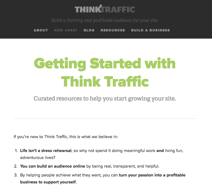
In this post Corbett Barr says Think Traffic’s Start here page accounts for 7% of the overall email subscriptions.
This may not seem like a lot, but considering only 11% of all subscriptions come from more common real estate the post page sidebar, this page starts to make more sense .
2. Coming From (Social Network)
High Converting Landing Page Rule #1: Never send traffic from an ad to your home page.
It’s common knowledge within PPC advertising circles that pointing your ad directly to your homepage is a no-no. Somehow that same rule never caught on to social networks.
But really, isn’t social media a dynamic ad for your business?
Consider how people get to this page: They like what you have to say, click on your profile, read your bio, click the link. Why not capitalize on this interest?
The main point of this page, and many others in this roundup is to give extra context, acknowledge where the user is coming from, and convert that reader into a subscriber.
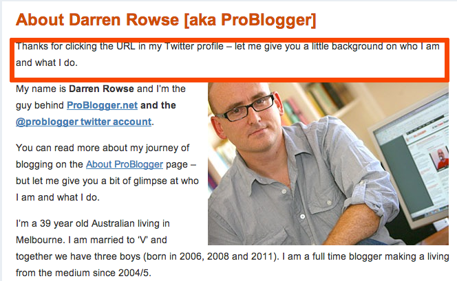
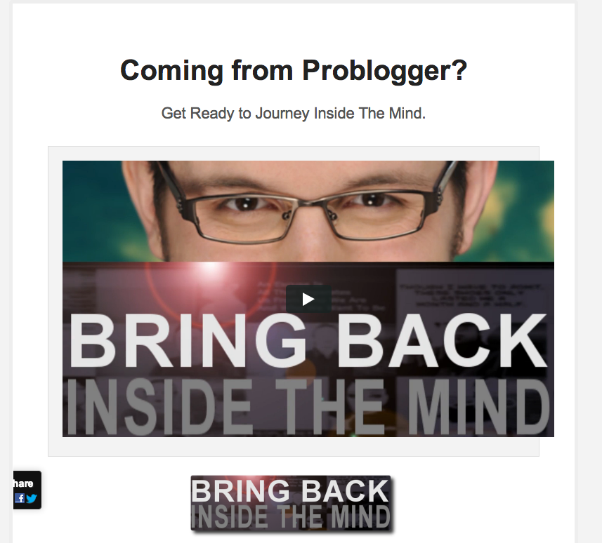
This page by Problogger does a great job at giving visitors a quick look at the most important sections of the site.
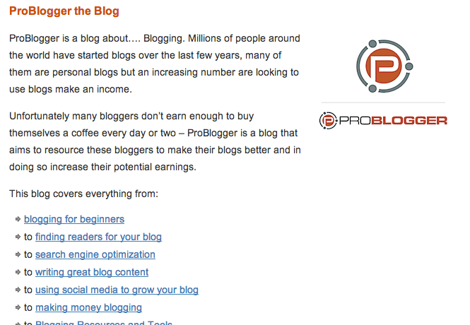
Now this is just my opinion, but I believe this page has too many links. Realistically, a visitor coming from social media channel won’t stay long because the switch from fast paced social media vs long form content is too jarring.
Instead, it’s worth using “Coming From (social network)” as a way to offer a resource related to the social network (& your business) in exchange for an email address.
Either that, or offer fewer options & link to the best stuff on your site to guide these visitors to a stronger point of conversion.
3. Custom Landing Pages for Guest Posts
The principle of this landing page is similar the last two. When you guest post, instead linking to your home page in your bio, link to a custom landing page specifically designed for the visitors of that site.
This tactic is especially useful if you’ve mention in your byline a lead magnet that solves the problem your guest post explores.
In this post Neil Patel talks about getting 1,000 subscribers in 60 days by guest bloggingexclusively. He says,
“I’ve seen registrations jump over 10% with personalized landing pages like that.”
“That personalized landing page is a critical piece…so don’t skip it. It’s truly the best way to maximize all of your hard work!”
4. Blog Comment Landing Page
When you leave comment, you leave your name, email address, and Url. But if you’re linking directly to your homepage you’re not making the most of your comment.
Realistically, you won’t have landing pages for every site you comment on. But if you have landing pages for the sites you comment on the most, you can quickly orientate people after they’ve clicked your link.
To do this, acknowledge the site your visitor is coming from in the headline.
“Liked my comment on ConversionXL?”
Introduce who your site is for, how it helps, and include a brief blurb about you.
Most importantly, curate a list of links that are the contextually relevant to the section of site you’re commenting on.
For example, if you’ve written great UX tutorials, and you’re commenting on one of the UX posts on ConversionXL have your landing page include links to your best UX work to draw people deeper into your site.
Hat Tip to http://pro-landing-pages.com/ for the tip.
5. Post Subscription Sign-UP
If you want email subscribers to actually consume your content, the first step is to get them to confirm their subscription.
Ramit Sethi of Iwillteachyoutoberich.com uses a few age old practices to drive new subscribers back to their inbox and fully opt in.
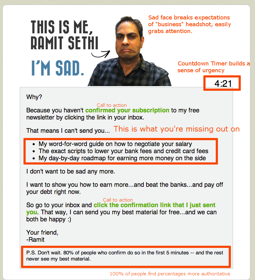
While there are a number of things going on on this page, the most standout is the use of the timer.
Research shows when timers are introduced in “low impact” decision making, the added urgency compels people to take the path with the least resistance. On this sign up page, the path is laid out, as well as what you’ll be missing if action is not taken.
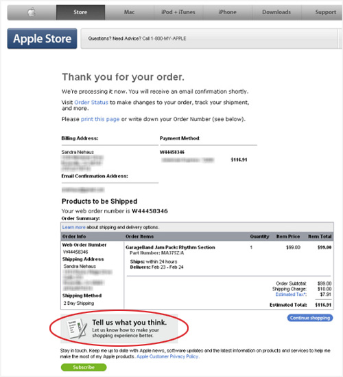
6. “Thank You” Page With Entry Level Offer
The “Thank You For Subscribing Page” is one of biggest missed opportunities online.
When you’re designing for user flow, you’ve lead your user through a series of steps to encourage them to sign up for your email list, so why stop there?
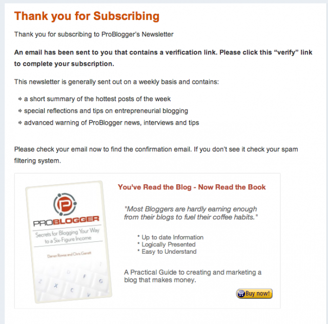
Now that they’ve committed to getting the free thing, it’s going to be much easier to applybasic upselling psychology to get them to buy into the paid thing, IF that paid thing is a lower cost, and if the paid thing is a logical extension of the path your visitor took to get there.
Depending on your paid offer, it’s worth playing with different pricing strategies here.
It’s also worth noting that this page could be used to convert higher priced offers if that offer acts as a shortcut. (I.e Free 20 week course on Facebook Marketing with an offer for a private hour long consultation session)
7. (Alternative) Thank You Page With “Refer A Friend” CTA.
Thrillist’s invite friends page encourages freshly subscribed visitors to share their new discovery with their peers.
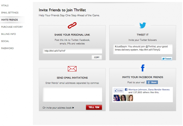
Research by marketing professors Andreas Kaplan and Michael Haenlein suggests that in order for something to go viral, three basic criteria must be met; giving the right message to the right messengers in the right environment.
In this case, the refer a friend thank you page is the perfect opportunity to encourage new subscribers who signed up for your lead magnet to share with their friends and increase your viral quotient. According to Topsy, Thrillist’s use of this strategy lead to 77 extra mentions on twitter in the last month alone.
Bonus: Make the deal even more irresistible. In exchange for friends subscribing via their share link, offer a discount on your lower level offer.
8. Thank You Page w/ Survey
What better way to learn about your customers than to ask them a few questions right after the conversion takes place?
While this doesn’t directly affect your conversions, the feedback you gather in this survey can be critical to creating new offers or addressing design flows in the long run.
Don’t quite know what to ask? This report from Constant Contact gives you sample survey questions for different scenarios.
9. Social Media Hub Page
No doubt, at some point you’ve heard the phrase “curate interesting content.” problem is, doing this only through social media channels does nothing to directly improve your email subscription rate.
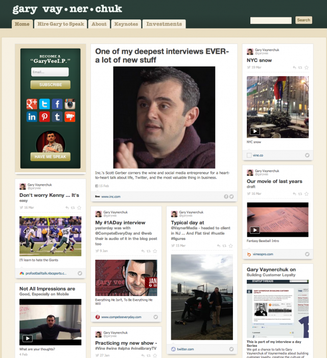
Enter RebelMouse. A startup that focuses on pulling all of your social media feeds together and publishing the content into one easy to digest page. But how does this impact your conversion rates?
If email newsletters are a part of your overall strategy, this page is becomes the main hub for all of the content you’ve found share-worthy.
A call to action saying “Want me to email you only the best of what you see here?” is a great reminder that you take filtering the best seriously. This page is a huge visual reminder that an email address is a small price in exchange for finding and filtering content.
10. The Resource Library Page
If you find yourself recommending the same books and resources over and over again, the Resource Library page is a you to compile all of your most commonly used resources.
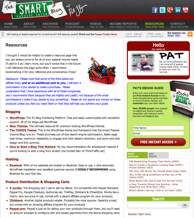
Generally speaking, this page is used for publishing various affiliate offers such as software, ebooks and books, information courses, or physical products.
Comparing January’s income report of SmartPassiveIncome.com against the resource page, you’ll notice that a total of 14 out 25 items on the income report are found on the resource page, making this page something to really consider.
If you haven’t gotten started with affiliate marketing yet, Shareasale, Clickbank, orAmazon Associates.
For more info on affiliate marketing:
- 30 Tips For Successful Affiliate Marketing
- Sugarrae’s Affiliate Marketing Category
- Affiliate Marketing 101
11. Clever Unsubscribe Page
What’s the most common reason people give for unsubscribing to your email list? Too many emails, right?
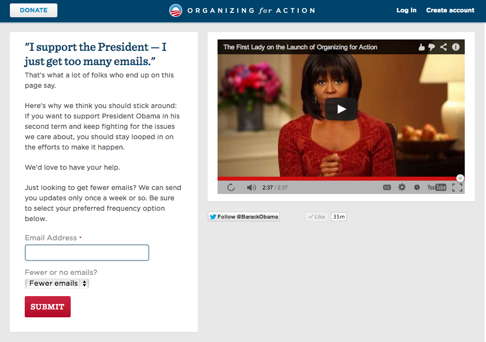
This clever unsubscribe page doesn’t let your email subscribers get away easy. Instead of making email email an all or nothing deal, users have the option option to receive fewer emails, in case it really is a matter of information overload.
Also, notice the social media buttons under the video? By giving an alternative to email, you’re respecting their decision while subtly reminding them they don’t have to shut you off entirely.
12. Email Signature Page
When someone clicks on the name in your email signature, where do you send them?
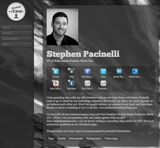
Most people, it’s going to be the home page, right? But what if you could take this opportunity to introduce who you are and what you’re passionate about?
While it may seem similar to the Blog Comment Page, or even the Coming From (social network) page, the major difference is, the person clicking on this link already has your email. Meaning you’re at a different point in your relationship than somebody who’s just passively checking you out on social media.
Use this opportunity to add a more personal touch to your communication.
Bonus: Using a service like http://dooid.me to power this page allows you to enable vCard information, allowing your new friend to add all of your details in just one click.
Hat Tip to http://pro-landing-pages.com/ for the tip
13. Live Hangout/ Consolidated Conversation Page
This is a new one I’ve just started playing around with, and I’m really excited to share it with you.
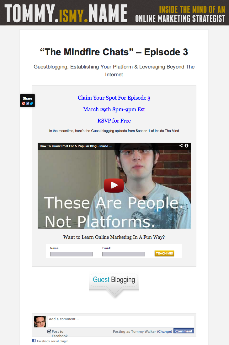
You see it all the time with live events, the event coordinator says “if you want to participate, use the hashtag #blahblah on Twitter.”
Problem is, too many people using a hashtag makes conversation difficult to follow, requires your users and if the conversation is lively, your participants have a hard time interacting with each other.
Also, if you’re using a live-streaming platform like Google+ Hangouts, using the default tools vs embedding on your own site means you’re missing a chance to improve your “time on site” metrics & convert viewers into subscribers.
Fortunately, with a little pre-planning, this is easily fixed.
All you have to do is Embed your live-stream:
![]()
Embed the email signup:

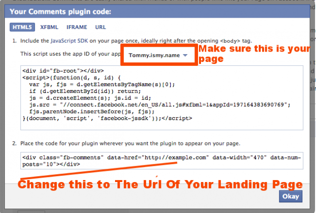
And Embed Facebook Comments onto a single page:
Once this is set up, you’ll have a single consolidated place for viewers to watch, interact with each other, and get bonuses.
Bonus: Visitors can publish comments to their personal Facebook Profiles or Facebook Pages, sharing your page directly with friends and fans comment box. If your live chat is interesting, your visitors will happy to share with their friends, maximizing the potential reach for your live event.
Conclusion
By putting just a little extra thought into where your visitors are coming from, you can create additional real estate opportunities on your site to break expectations, increase conversions, and maximize reach with minimal effort.
Curious, are there other unconventional landing page strategies you’ve used that you’d like to share?
Meet Peep Laja
About the Author» Peep Laja runs a conversion optimization agency Markitektand helps businesses solve conversion problems at his blog ConversionXL.
Original Article » 13 Unconventional Landing Page Strategies To Increase Conversions