
5 Ways to Make Business Card Logos Pop
July 3, 2013 | By Peter Snowden | 5 Comments">5 Comments
Though they may realize the importance of logos, some business owners ignore the ramifications of even small changes to the design of the business card logos.
For example, the Harvard Business Review found consumers directly associate a symmetrical logo with ethical business practices. Besides keeping your logo in proportion, here are five ways you can ensure your business card logo stands out and sends the right message on your business card.
Use Creative Printing
The company doing your business card printing will be able to advise you on the most cost-efficient combinations of colors and special features, such as embossment or gloss. While varnish on the entire card makes it difficult to add your personal number or notes— a faux pas, according to business strategist Tim Tyrell-Smith— a spot of gloss is very impactful on an otherwise matte card.
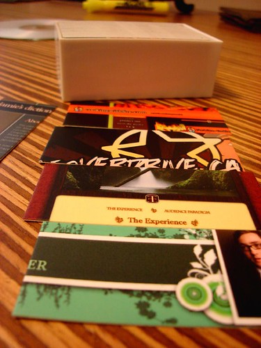
Photo by Connor Turner via Flickr
Consider Your Audience
The people getting your card may need to scan it quickly or read it in dim light and will certainly need to find your information on it later. Don’t sacrifice clarity for design. Size 10 fonts or higher in dark colors are the most readable. Resist the temptation to print contact information over your logo as a background, as this can obscure both. A better choice would be a large logo set to the side.
Think Front and Back
Small business card logos can be lost among a sea of tag lines, email addresses, Twitter links and phone numbers. Tyrell-Smith suggests devoting the back of the card to a logo and brand promise— a short phrase that explains exactly the services you can deliver to a client. This leaves room for customers to write notes and makes a bold first impression.
Choose the Right Background Color
Consumers strongly associate colors with certain types of brands. Green cards evoke images of health and environmentalism, and Empower Yourself with Color Psychology says a bit of red in the logo signals excitement. If your logo is already established, don’t change it. Brand consistency is most important in business card logos design. Instead, change the color of the card itself to send a message that aligns with or adds to your logo design. A black card, for example, makes a powerful statement and allows the logo to pop.
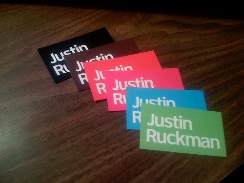
Photo by Justin Ruckman via Flickr
Focus Your Message
Designers at Naldz Graphics recommend you thoroughly evaluate your goals for your card. Take a step back from your current design and consider the impression it gives. Poll people about whether they can read your text and what they assume your business does. A card with cut-out text may be memorable, but it may also leave the recipient only thinking about the interesting design, with little or no conception of the individual’s abilities or even their job title. Alternatively, cards that creatively incorporate business goals with design (for example, a comb-shaped stylist card or easel for an art studio, displayed by Creative Nerds) gives you the opportunity to make a minimalist canvas that highlights the logo and keeps the attention on your work.
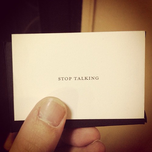
Photo by Seth Thomas Rasmussen via Flickr
How have you made your business card logo stand out? Tell us in the comments.
Meet Peter Snowden
About the Author >> Peter is a business writer from Minneapolis, Minnesota who rebuilds rare cars on the weekends. He is the father of three little girls and has two dogs named Moose and Bronx.