How to Use Visual Content to Drive Traffic, Shares and Sales with Donna Moritz
September 2, 2015 | By Amy Porterfield | One Comment">One Comment
This post originally appeared on AmyPorterfield.com.
As humans, we are hardwired to connect emotionally with visual content. Pictures in particular–we process them very quickly–faster than text, video, or audio. Pictures allow us to make a really quick decision about whether we are going to engage with something.
It’s no secret that some of the most successful brands in the world owe their popularity to their visual content strategy. Notice I said strategy–in other words, not just any visual content will do.
Fortunately, one of the world’s biggest experts in visual social media and content strategy is also a good friend of mine.

You probably know Donna Moritz already as the power behind Socially Sorted, the award-winning blog about using visual content on social media. I know her as my #1 student from the very first Profit Lab course I ever launched. She’s also shown up on this site more than once – I interviewed her briefly a few weeks ago, and she created an amazing guest blog for me about Pinterest.
But today, Donna is here to school me–and you–in how to set up a visual content strategy that supports your sales and sends your message.
Before she became the renowned expert she is today, Donna learned all the ins and outs of visual content strategy through simple practice. After working in several different businesses–sometimes for others, sometimes for herself–she saw how visual content really created that initial resonance with a target audience that makes them want to learn more.
The main thing with your visual content is to “stop the scroll” – in other words, arrest your audience’s attention so that their finger pauses above their mouse or smartphone screen, and they take the time to engage with your message.
The more Donna learned, the more excited she got about the potential of various kinds of visual content. If you’ve ever felt overwhelmed by the sheer variety of visual content styles out there, don’t worry–Donna is here to break it into three basic levels.
1. Shareables
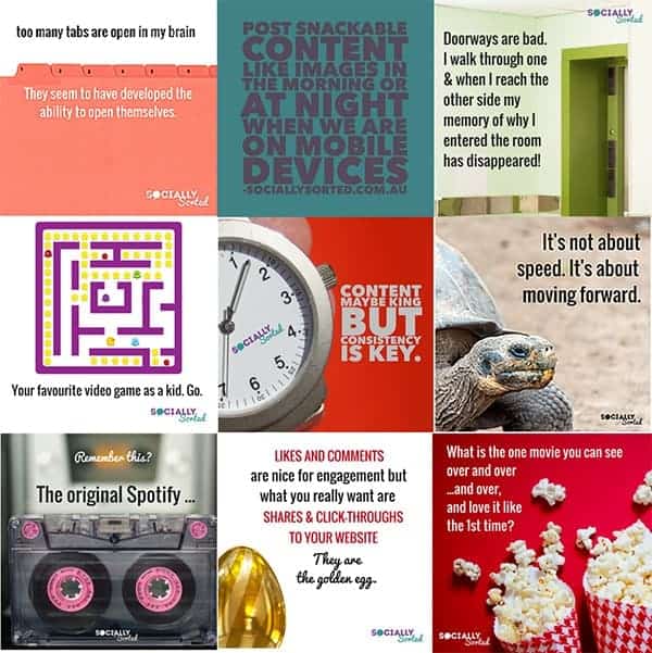
These are the really easy-to-create, easy-to-share individual images that would be on Facebook, Pinterest and Instagram. Think funny photos, behind-the-scenes shots, images that incorporate quotes, tips or other short bits of text. They are really a good jumping-off point to lead into a longer message.
Here is a sample batch of quote images, observational humor, business tips, questions and motivational images ready to go (and all created on Canva and WordSwag).
These types of images are designed to increase reach and engagement.

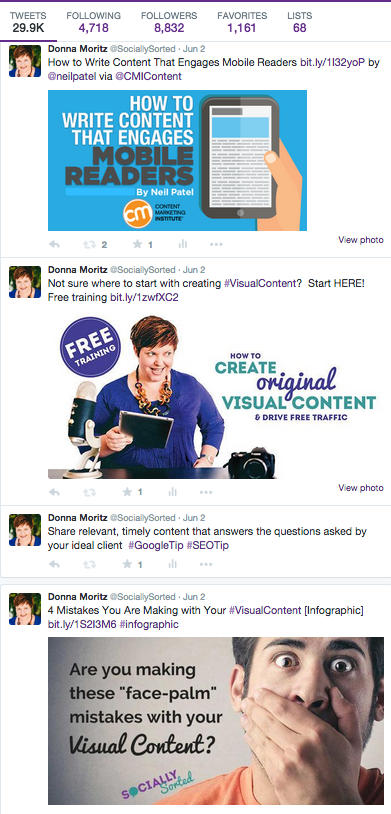
Shareable images get their strength from their simplicity. But that doesn’t mean you can only use them for short, simple concepts. By attaching an image with a call to action or link, you can increase shares (such as retweets on Twitter) and generate more visits to your blog or other “landing content.”
Also, remember that tweets with images get retweeted twice as often…so post images!

Remember, on all platforms, it is important to keep a balance of your own helpful and entertaining content, and curated content from other pages or businesses. This earns you the right to post some promotional images with calls to action.
You can also work with your designer if you want to save time (and money) or can’t design the images yourself. Ask your designer to create a template which you can then add text to. This way, you can create a series of quotes or tips using a great design, but reduce the cost and time involved in hiring a designer. One image becomes many!
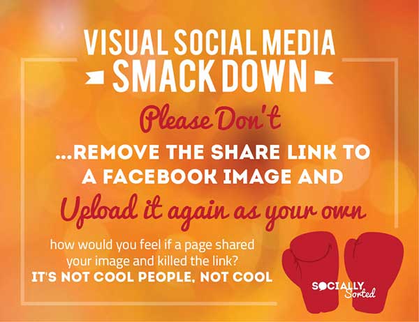
Here’s a template Donna had designed:

Using this template, she can create multiple images using a tool like Canva or Picmonkey:

2. Step-by-Steps
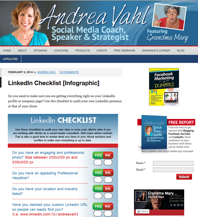
Checklists, how-to images and tutorials are all great examples of “Step-by-Step” images. This format is deal for sharing procedures, systems or “secret sauces” with your community.
These images work particularly well on Pinterest and get shared a lot.
This kind of visual content doesn’t need to be fancy or even overly designed–they just need to be helpful and easy to use. Remember, people love shortcuts…so with these images, they’re probably going to look right past the bells and whistles of a great visual design to get to the content you’re offering!
Social media expert Andrea Vahl did a great series of simple checklists to help her readers on her blog.

3. Showpieces
Showpieces are the pieces of content that require more investment of time and resources but are most likely to bring better return in terms of sharing and traffic. This includes infographics, slide decks and short video.
Here is an example of a slide deck that was produced to drive traffic back to a blog post and a webinar sign-up form:
Here is an infographic that was designed to drive traffic to a blog post for list building purposes. This infographic is still shared regularly more than two years afterwards:

Donna recently posted a blog of her own about these three levels of visual content, with even more info about each one. It’s called “9 Ways to Take Your Visual Content Up a Level,” and it’s definitely worth checking out.
Get Creative
If you’re reading this and thinking it doesn’t apply to you because you’re not a “creative type,” think again! The amazing tools that are available out there right now–tools like PicMonkey, WordSwag and (my personal favorite) Canva – are set up so that anyone can create simple but stunning visual content. Don’t worry if you don’t have a “designer’s eye”–these tools have templates so that all you have to do is plug in your favorite background, choose a font you like, and voilà! Beautiful, polished, eye-catching imagery.
One important thing to note, however, is that size matters. Different platforms will have different optimum size requirements for your image.
* Be sure to check out Heyo’s Facebook Image Size Cheatsheet here.

