10 鼓舞人心的网站设计,将控制在 2016
三月 3, 2016 | 由 乔伊斯·梅森 | 没有评论">没有评论
设计趋势是永恒的 - 他们跨越数年至十年取决于他们如何了观众的好评. 然而, 最近几年, 随着科技的飞速发展, 设计趋势正在迅速与用户的兴趣变化. 企业到他们的网站的外观放在第一位,以获得竞争优势,吸引更多的用户.
Thanks to the increasing number of online graphic tools, last year we saw at least a dozen designs dominate the web world. From card-style layouts to video headers to tiny animations, web designs grew in popularity. This year, we could see some of them continue their domination and a few new ones as well. 让我们来看看 10 website designs that could steal the show in 2016.
1. Vertical Scrolling

With most people accessing websites on the go, it is estimated that mobile traffic could equal (or even surpass) desktop traffic in the coming years. Taking this into consideration, a lot of website owners are betting on vertical scrolling patterns. The thing about this type of design is, it makes web surfing a lot easier and leads to better user experience.
2. Card-like Interfaces

Card-inspired templates are finding their way in websites, 应用程序, and printed forms. The thing with card-type layouts is, they are easy to browse through, more engaging, and they present content in an engaging manner for users. There is no limit to creativity here – you can come up with your own design, shapes, and colors and mesmerize your visitors with your interface.
3. Video Headers
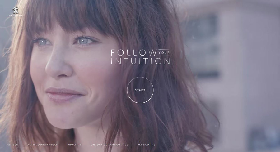
High speed Internet connections and people’s fondness to media-rich content have lead to the rise of movie-style videos in website headers. What better way to explain your business than use a short 2-minute video enriched with sharp images, captivating graphics, and nice background music?
4. Small Animations

Animations are getting smaller, but their popularity is getting bigger by the year. From subtle motion to data animation to guiding animation, there are lots of concepts to choose from. Most websites use tiny animations to provide an element of surprise to visitors once the page has completed loading. Brilliant animations are all about creating special effects to entice users to explore your content. Apple, Fleet Fleet, 和 Pixate are some of the popular sites that have used tiny animations to a great effect. You could check their sites for an idea!
5. Better Typography

更大, bolder fonts are being preferred by a lot of websites because they work well with the other visual elements in the homepage and ultimately increase the readability of the content. Websites that use typography believe that combining readable typefaces with stunning graphics is a better way to deliver their brand message to the audience.
6. Illustration and sketches

There is something with the idea of pairing digital designs with hand-crafted arts that never seems to bore visitors. Even a lifeless website comes alive with the use of eye-catching sketchings and drawings. From icons to clickable buttons to the other interface elements, using illustrations and sketches lets you give your users an enjoyable browsing experience.
7. Bold and bright colors

Using bright colors and bolder fonts on your homepage is a smart way to make the key area of your content stand out and be read by your audience. Desert Chill, Apigee, and Rainbow Nursery are some notable sites that have used the ‘magic of colors’ to their advantage. Please do check them out.
8. Own photos, not stock photos

Stock photos are outdated and boring. A few sites have already started using their own photography for the sake of uniqueness and credibility. 瞅 Netflix, which delivers its brand message with its own photography in the background. Original images are more natural and authentic and we could see a lot of websites use them in 2016.
9. Collaboration Tools

It’s quite common that not all designers work at the same office – some work from home, some work at the office and clients are usually from different countries. This is where using real-time collaboration tools can make a difference. They make the web design process a lot quicker and easier. Even feedback can be received and applied in a professional manner. From our research, 我们发现, Trello, Yammer的, Red Pen, Invision, 和 GoVisually are some top collaboration tools for web designers.
10. Full-screen Forms

With a huge amount of web traffic coming from mobile users, using full-screen forms in the homepage has become a regular practice in the industry. We saw a lot of websites use this approach effectively in 2015 and the trend is most likely to continue into 2016.
From searching an item to subscribing to newsletters to signing up, full-screen forms can come in handy. When used correctly, they enable users to focus more on their tasks.
结论
所以, which of these designs do you think will dominate in 2016? Which design will you prefer for your site? Please let us know in the comments. 谢谢!
见面乔伊斯·梅森
Joyce is the writer at designpickle, a website dedicated to building websites, Social media graphics, Event flyers, Brochures, E-book covers, Banner ads, Signage, and T-shirts for businesses.